Studio Ghibli films are one of my favourite films, they are always beautifully drawn and composed; they always feel nostalgic and have a sense of time passing and appreciation of life in them. I specifically like the way Miyazaki uses binary oppositions in colouring in the frames of his films.
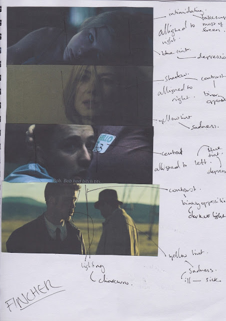
David Fincher's style can be described as an auteur, his centrally alligned frames in his films are aesthetically pleasing and the yellow/blue colouring shows a sickly, gloom setting.
Misrach, the inspiration for the True Detective title sequences uses symmetry in his photography which is aesthetically pleasing and also uses soft colour palettes to add to this.
I attempted to replicate shot types by these photographers/film makers / animators, some of which were more successful than others. For example, I like the photo of a dark figure standing by the water edge and think that it is very similar to Misrach's own. I think by 'copying' the artists work it makes me think about how the artist created those shots and think more about lighting and composition of the frame; this has made me think more about my own shots that I will use in my film and heavily consider lighting and composition of the frame in the storyboarding process and while on set.


No comments:
Post a Comment