Tuesday 29 September 2015

Foley to an image: Nighthawk

I decided that in addition to creating a foley piece to a movie clip, I would also create foley to a still image, I chose the painting Nighthawk - this is a link to the painting.


Seb and Andrew discussed the option of creating sounds to a still image instead of a film clip. To further myself in this project I decided to create both.

I think the sound in this piece represents this painting well and the atmosphere it creates. I don't this piece was very successful, I think I made the audio sound too busy in comparison with the image. To improve I think I could've added a soundtrack in the background of music playing in the diner. I think I could have also used some sort of sound that suggests a problem or changes the atmosphere - perhaps using dialogue.

feedback? how did this help develop work? So far I have no feedback, to improve my piece I would ask others for their opinion and add to it according to the given feedback.

From this task I have took away the experience of creating foley sounds and that I enjoy this process. I think with a range of items I could create a larger range of foley sounds. I think I might use foley sound in other works to further emphasise the sounds used.



Thursday 24 September 2015

Sound Journey Piece


This is the piece I have created through my own foley sound as listed in the previous post. I layered the noises over each other and played around with the loudness and pitch of each audio clip. I used the lighter audio clips at the beginning and built up, using the louder foley sounds towards the end of the clip. I was unable to use Auditions to edit due to an issue with licences, therefore I edited this audio piece on Final Cut Pro. To improve I would use Auditions and create more foley to have more of a build up.


Wednesday 23 September 2015

History of Foley


Creating Foley Sound

Foley Sound ideas to recreate Thunderstorm:
  • plastic bag - wind/thunder
  • batteries in plastic box rolling around - thunder
  • rice moving in metal box - rain
  • pots and pans banging together - lightning
  • foil shaking - thunder/rain
  • shower water - rain
  • shaking a leather jacket - thunder

Sound Design 22/9/15


Sound Design HW


The cinematography in The Conversation, is shown from above whereas the sound is captured from below and in the van as shown in the clip.

I think that the distortion is effective with the audience - because you don't really know what is going on until you have seen the ear pieces, microphones and vans. I like the juxtaposition of the sound being captured from below and the cinematography from above in the first few seconds of the scene.

If I were to recreate this I would use white noise instead of the digital distortion heard throughout the extract as I don't think it makes it obvious to the reader what is happening - I would also include a distortion similar to when a microphone gets too close to a speaker when the spies are too close to the couple. I think the white noise would slightly confuse the audience as the image would not be distorted. I would also use more ambient noises such as people talking, breathing, walking in the beginning - I understand that the music is very loud, but I don't think that a busy street would not include people talking while music is being played. I think I would also include sounds of fabric touching fabric and muffling when the couples touch each other or are close to each other to show that one of the pair are wearing a microphone. I would cut the music completely when are protagonist that gets into the van when he does not have on the earphones to hear what is being said, highlighting that he is the protagonist and who the audience should be following, also creating a sense of mystery. I would also not use the piano at the end of the clip, instead replacing it with ambient noises and picking up on some key sounds when passing certain parts in the extract, for example hearing parts of a conversation when passing a group of people.


To improve this extract in Blade Runner, I would exaggerate the sound of the fan rotating above the man, as it is a close object to him, but that is not reflected in the sound. In class we debated as to whether or not the exaggerated heartbeat was diegetic or non-diegetic. I would argue that the heartbeat is diegetic, as it is in the film world. There is also nothing to suggest that it is a heartbeat, it could be the rotating fan above the pair. One of the characters speaks while the heartbeat is exaggerated and the voice slightly echoes, which the character's voice hasn't echoed before and it is only at that point - so if the heartbeat is non diegetic so is that voice, but the other character in the scene can hear the voice - the voice is only echoing to him, which means that he is feeling disorientated and hears specific key sounds that are to him, including his own heartbeat - the close up of this character also shows that we are only concentrating on this character and what he can think, feel and hear. I would make the first gunshot sound more like a gun shot instead of it sounding like something from Star Wars guns.

Sound Design 21/9/15

Sound is immaterial. Perception of sound relies on sound. We recognise things through sound information by the sound they make. Sonic information - imbued in objects + events, especially when we see them. Sonic information - more subjective visual information. You can picture an event by hearing key sounds.

Sound Journey:

  • No non-diegetic music
  • No more than 1 minute

1 minute extract of film scene:
Think about:
  • Sound/feeling
  • film sound
  • diegesis
  • the mix
John Cage 4'33'': When viewing this it felt very surreal. I constantly felt like I was waiting for something to happen. Similarly to the exercise in class where we remained silent and focused on what we could hear - although there is supposed to be no sound - there still is sound - people breathing, fidgeting, coughing - it eventually becomes very irritating and annoying as you want to complete the silence. 


Similarly - this song The Ballad of Richard Nixon by John Denver does the same.


The Architecture of Films Soundtrack:

1. Background - atmosphere and ambience
2. Foreground - sound spots and dialogue (including music payed in diegesis)

Spot sounds - specific sounds played in foreground

Bibliography

 [ONLINE] Available at: http://www.aphotostudent.com/wp-content/uploads/2010/11/biteCarucci.jpg. [Accessed 23 September 2015].

[ONLINE] Available at:https://i.vimeocdn.com/video/264013996_640.jpg. [Accessed 23 September 2015].


[ONLINE] Available at: https://blogger.googleusercontent.com/img/b/R29vZ2xl/AVvXsEiY5YycnhvVH6SZUOcpcVJUS6QoSp45yBia4cETvlPnKl5TS3vSipfGWtNUuGJtsBVw-_6M4XHAKlCXg0uQ8OZVfsaAPydozo4XknzqJEYFCU7dln8dPFU-nT03SINDLOrVexVb1q8FwG8/s1600/Screen+shot+2011-03-15+at+12.18.57+AM.png. [Accessed 23 September 2015].


[ONLINE] Available at:https://upload.wikimedia.org/wikipedia/en/6/6f/Misty_and_Jimmy.jpg. [Accessed 23 September 2015].


ONLINE] Available at: http://www.bjork.fr/IMG/jpg/bjork-2000-nan-goldin-02.jpg. [Accessed 23 September 2015].


[ONLINE] Available at: http://www.artandsmoke.com/wp-content/uploads/2013/08/Nan-Goldin-Battered.jpg. [Accessed 23 September 2015].


[ONLINE] Available at: http://www.ormsconnect.co.za/wp-content/uploads/2013/03/Zanele-Muholi-02.jpg. [Accessed 23 September 2015].


[ONLINE] Available at: http://superselected.com/wp-content/uploads/2014/03/Zanele-Muholi-Art-02.jpg. [Accessed 23 September 2015].


[ONLINE] Available at:http://www.gladstonegallery.com/sites/default/files/styles/work_detail/public/SN033_w.jpg. [Accessed 23 September 2015]


Shirin Neshat: Art in exile | TED Talk | TED.com. 2015. Shirin Neshat: Art in exile | TED Talk | TED.com. [ONLINE] Available at:http://www.ted.com/talks/shirin_neshat_art_in_exile?language=en. [Accessed 23 September 2015].


[ONLINE] Available at:http://www.studiolum.com/wang/tarkovsky/mozaik-550-tarkovsky2.jpg. [Accessed 23 September 2015].


[ONLINE] Available at: http://www.e-flux.com/wp-content/uploads/2013/10/0f620_oct21_frankfurt_img.jpg. [Accessed 23 September 2015].


Life Drawing 23/9/15

Today, a model posed for us and we drew him - here are photographs of my drawings. 


I liked the experience of drawing a model - I have drawn plenty of fruit bowls, skeletons and skulls in the past life drawing lessons I have experienced, so it felt new and interesting to draw a person paying extreme detail to human anatomy. I think I found the quick drawings more difficult as I like to spend time on my drawings adding as much detail as possible. I also found the movement pieces harder as the model didn't remain still - to record the movements I ended up creating a circle of sausage style people, which I didn't really like. I also found it difficult to drawing with charcoal as I don't enjoy getting my hands too dirty, which you do with charcoal. However it surprised me when I found that the charcoal drawing was one of my favourites - I liked the simplistic style with only slight detail. 


Monday 14 September 2015

14/9/15 Other Artists


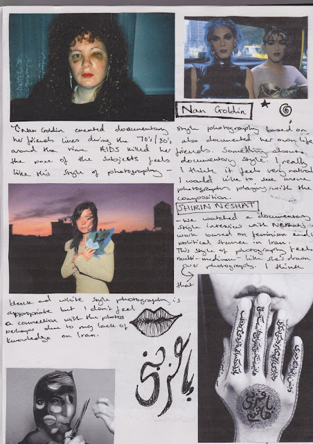
Shirin Neshat Interview:


14/9/15 - Identity photos


These are a selection of photographs I have chosen to represent my identity.


Bradley - He is the person I've known the longest, with Bradley there wouldn't be Lauren. Bradley was my womb mate and is my twin brother. Every childhood memory I have is with Bradley. We have been with each other through every step of the way, GCSE's, A Levels. Attending University, this is the first time we've really ever been apart.
 Nandos - After researching into the social identity theory and discovering that we create social rivals in order to make ourselves feel better, it was after this that I had the thought that experiences can also define our identity, experiences with overcoming illness or drugs, climbing the Tower of London - but also the things we haven't experienced. I have never been to a Nandos, and most people think that it's weird. It's a part of my identity, but an example of something that can easily be changed.
 The Apple brand to me, represents creativity. I think I am creative, through art and film. But this picture of my macbook also represents how hard I work to get something I want - it shows how determined I am to get something and further my career in film - I saved up months worth of Mcdonalds wages to buy it.
My Nike Scar - This photograph represents my imperfections, there's alot of imperfections that couldn't fit into one photograph hence just this photo. I burnt myself (at Mcdonalds) with a fry basket that formed this scar in the shape of the Nike symbol. I also convinced that if I tattoo 'Just Do It' next to the scar that Nike will pay me for advertisement space.
Sky - This is the view outside of my bedroom window, which I see everyday. I have spent 16/17 years in this house, in Welling. Welling is where my mum grew up so it's very much a part of my identity.

Thursday 10 September 2015

10/9/15 - Research Social Identity Theory

I felt stuck on the project, so I simply googled 'identity theory' and Social Identity Theory popped up.


Bibliography
Social Identity Theory: Simply Psychology 2015 Social Identity Theory [ONLINE] Last Accessed 10/9/2015 : http://www.simplypsychology.org/social-identity-theory.html


Wednesday 9 September 2015

9/9/15 - Blog

We spent the day learning how to use Blogger and what is expected on our blogs and in our sketchbooks:


  • Make it interesting visually
  • Make sure it shows reflection
  • Show the journey from beginning to product

8/9/15 - Gallery Trips

Today we visited a number of galleries to aid us with research and inspiration for our response to our Identity project.

We started at the V&A viewing the 'What is Luxury?' exhibition, photos of which can be found HERE

While I enjoy some installations in this exhibition, I don't think I took much inspiration for identity - personally I define luxury to be things that you can't buy - this might be a car, a house, a washing machine but also things like, time, good health and love. I don't think I associate luxury with my identity - however I will be mindful with my responses instead of sticking to generic responses.

The next gallery we visited was the Serpentine, photos can be found HERE

I didn't enjoy this gallery as much, I felt underwhelmed by the work - I didn't feel a personal connection with the paintings - perhaps due to the fact I am interested in film more than photography. I did like the unconventional dark on dark backgrounds of the paintings with a splash of colour, which inspires me to play around with lighting of my images/cinematography.

The National Photographers Gallery was my favourite place, photos can be found HERE

I felt the photography in the gallery was more my style, I liked the use of vibrant colours on simplistic backgrounds, which reminded me of photographer, Richard Misrach's work.


I felt that the photographs in the gallery related more to identity, as one of factors that define identity is place/environment. 

I even created my own response to a photograph I had spotted in the gallery. 


On the left, the original in the gallery and on the right, my own work snapped in London on the way to the last gallery.

The last gallery was the National Portrait Gallery, photos are HERE

I took the most inspiration from the work of GCSE students based off of identity - I liked the style of illustration over photography. One particular style photo uses black and white photography and outlines specific objects easily defined which I believe the artist had chosen object to define themselves.


7/9/15 - Identity

After our intro to photography, we discussed the idea of identity as that was the topic we were studying. My idea of Identity shows that you belong to a group. I created a mind map showing my ideas of Identity.


As a group, we broke down what defined our identity; Place or environment; our family and friends; our likes and dislikes; and our possessions. 

As a class we discussed our ideas. Other groups brought up physical appearance being a part of our identity as it can represent what genre of music we listen to etc, and attributes that can't change your identity. 

We discussed that identity was generally fluid, but that we had some control over our identity - or society does. 

7/9/15 - Introduction to Photography

The lesson began with a brief history of photography - while photography will not be my chosen area, it relates to my chosen area of film through the use of cinematography, which I can take inspiration from and apply to my work in the future.

I created a powerpoint based off of what I had learnt in the lesson.